Keep your web content visually appealing by implementing grid layouts into your work
Use rule of thirds in your grid design to create more appealing content
Keep a consistent grid layout when making a site. Pick a rule for your site and stick with it!
When you're styling grid content using CSS, make sure that percentages are used instead of pixels. Pixels don't carry over well when it comes to responsive design
When using images on a page, keep them at a consistent size. Don't stretch images if you can help it.
See below for more information
To crop images on a page, you can simply change the pixel height or height using CSS. However, if in doing that your image gets stretched consider hard cropping.
See below for more information
When uploading or using images on your site, ensure your images aren't pixelated. You can upload better quailty pictures for ease of use. If the image file is too large, it might take a while to load, but that can be corrected with software. See below for more information
Optimizing Images for Web
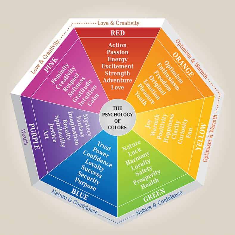
All colors convey a certain message or vibe to the end-user. Some colors can denote a feeling of happiness while other can invoke anger. It's up to you as the designer to choose the colors that will match the theme of your site.
Color Psychology InformationGive your site a consistent vibe and have it stand out by using a consistent color palette. Color palletes featured on the site below are professional designed to ensure the colors work well together.
As a note, don't mix colors at random as that will send mix messages to your user.
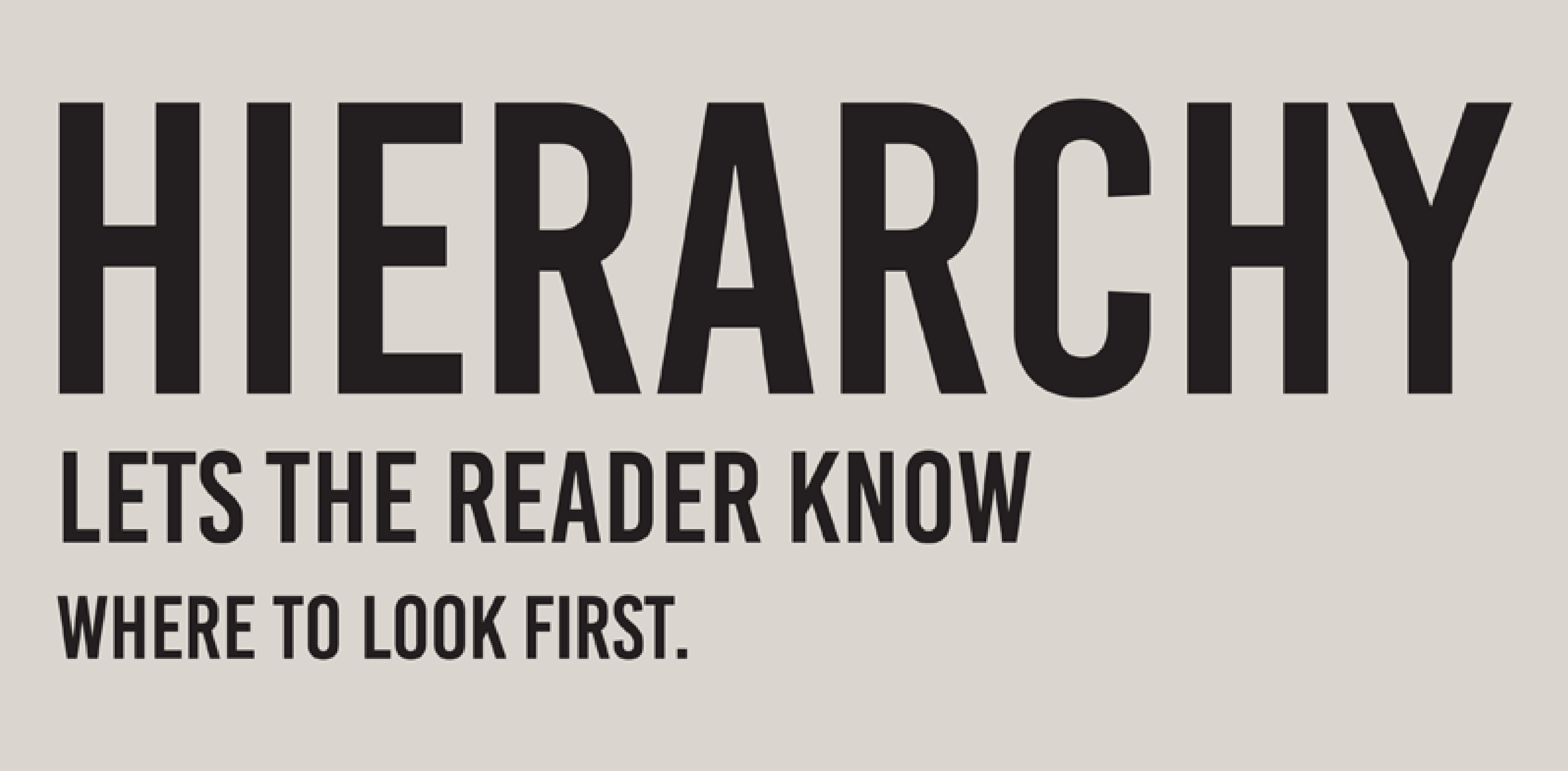
Contrast is important, your content should be easily readable to viewers whether they are close or far. For a good rule of thumb, have dark content on a light background, or light content on a dark background. Never use two light colors together, nor two dark colors
One of the best ways to visual guide a user through your webpage is to implement text hierarchy principles onto your project. To implement text hierarchy is to visually seperate the heading, subheading, and body of text in distinctive ways so that the user can easily follow the flow of information on a page. This technique is often implemented in print media, but can also be applied to web design to help guide the user through a page.
For more information on text heirarchy, select the link below. In addition, to the right there are two other examples on how text heirarchy can be implemented.
Text Heirarchy InformationThe easiest way to implement a form of visual text heirarchy is by changing the font size of different elements on your page. Main header titles should be the largest content of your page in terms of font, ideally 32px or greater.
Section headers should come in next between 24-32px
Finally paragraph tags should ideally be between 14-20px in terms of font size.
Use font weight as another way of guiding the user through your webpage. If a header is critically important, consider bolding the text with the b-tag in html
When changing the font style of your site, it can be tempting to choice many different styles for your site. Just like color, the style of font you choice can have an impact on the mood your site will convey. A good rule of thumb above all else is this:
Give your font, and all web content for that matter, room to breathe. Whether text is stored inside of a container, or free flowing on your site, ensure that the text has padding so it doesn't appear squashed
Principles of readable textThe rule of three says that things arranged in odd numbers are more appealing, memorable, and effective than even-numbered groupings. While this definition applies to interior design in this context, the rule of 3 can be applied to every design principle. For web design, keep it simple and use...